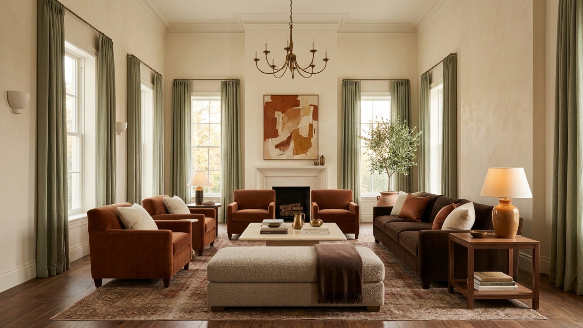
For the better part of a decade, walls answered to one boss. Beige, and its cooler cousin greige, promised safety, resale value, and rooms that photographed politely while feeling like very little at all. Then, somewhere around the fifth swatch of gray, the whole country seemed to look up from the paint deck at the same time and ask: is anyone actually happy here?
The answer arrived in the search data, and it is the color of espresso, terracotta, and very good chocolate. This is the story of 2026's warm palette, the numbers behind it, and exactly how to build a room on rust and brown without ever letting it feel dark.
The Obituary for Beige, Written in Search Data
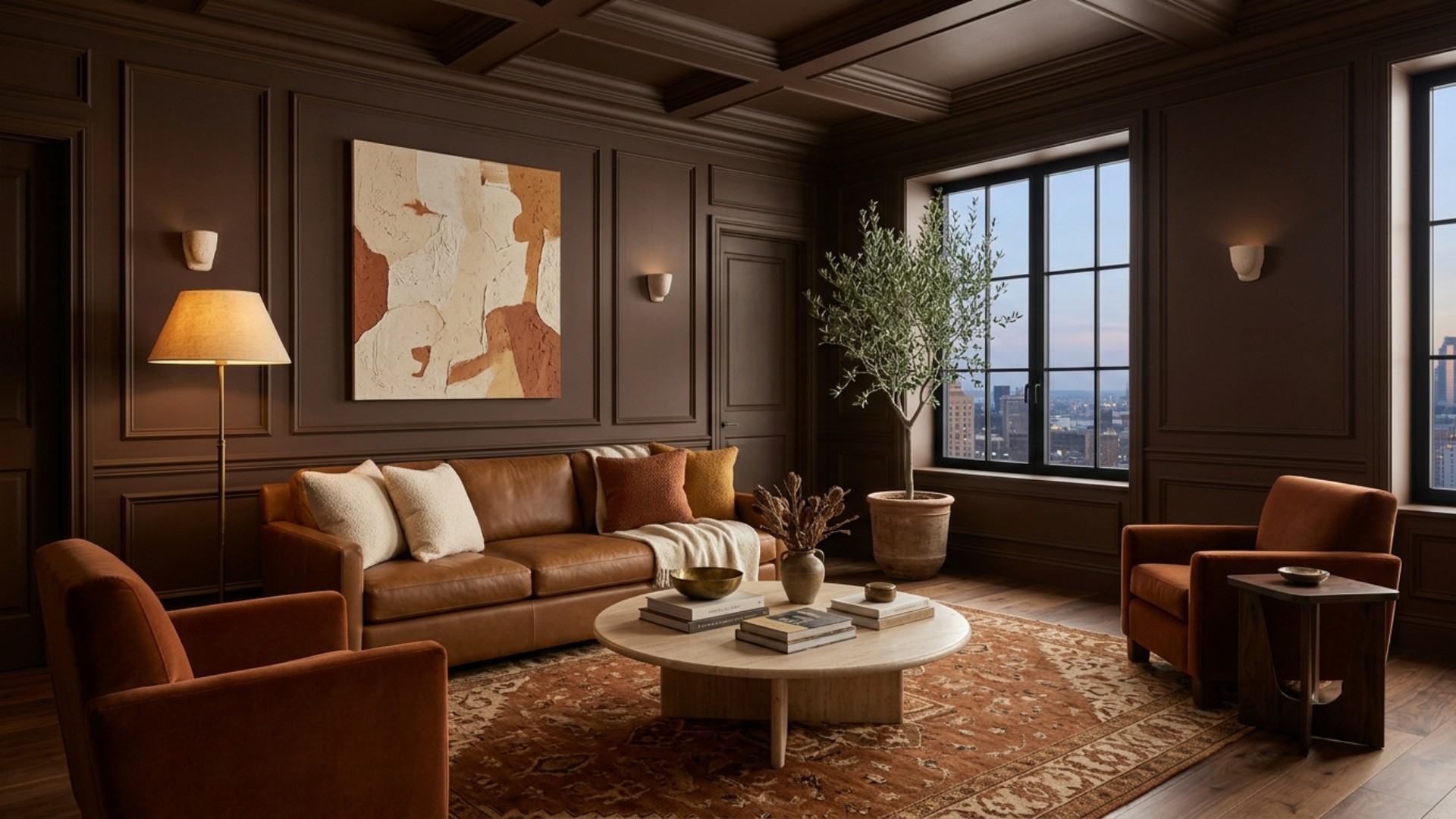
This shift is not a hunch, it is measured. The 2026 Houzz Emerging Summer Trends Report, drawn from US searches in the first quarter of 2026, found searches for rust colors up 178 percent and chocolate brown up 153 percent year over year. The supporting cast climbed right along with them: mushroom up 69 percent, sage up 55 percent, taupe up 50 percent, and cream up 44 percent. That is not a micro trend. That is a palette electing itself.
The professionals agree with the search bars, for once. In 1stDibs' ninth annual survey of 468 design professionals, 33 percent named chocolate brown the top trending color for 2026, and Benjamin Moore made it official by crowning Silhouette, a rich espresso brown with soft charcoal undertones, its 2026 Color of the Year. When homeowners, designers, and paint chemists all point the same direction, the beige era is not ending. It has ended.
Meet the Cast: Six Colors, One Warm Story
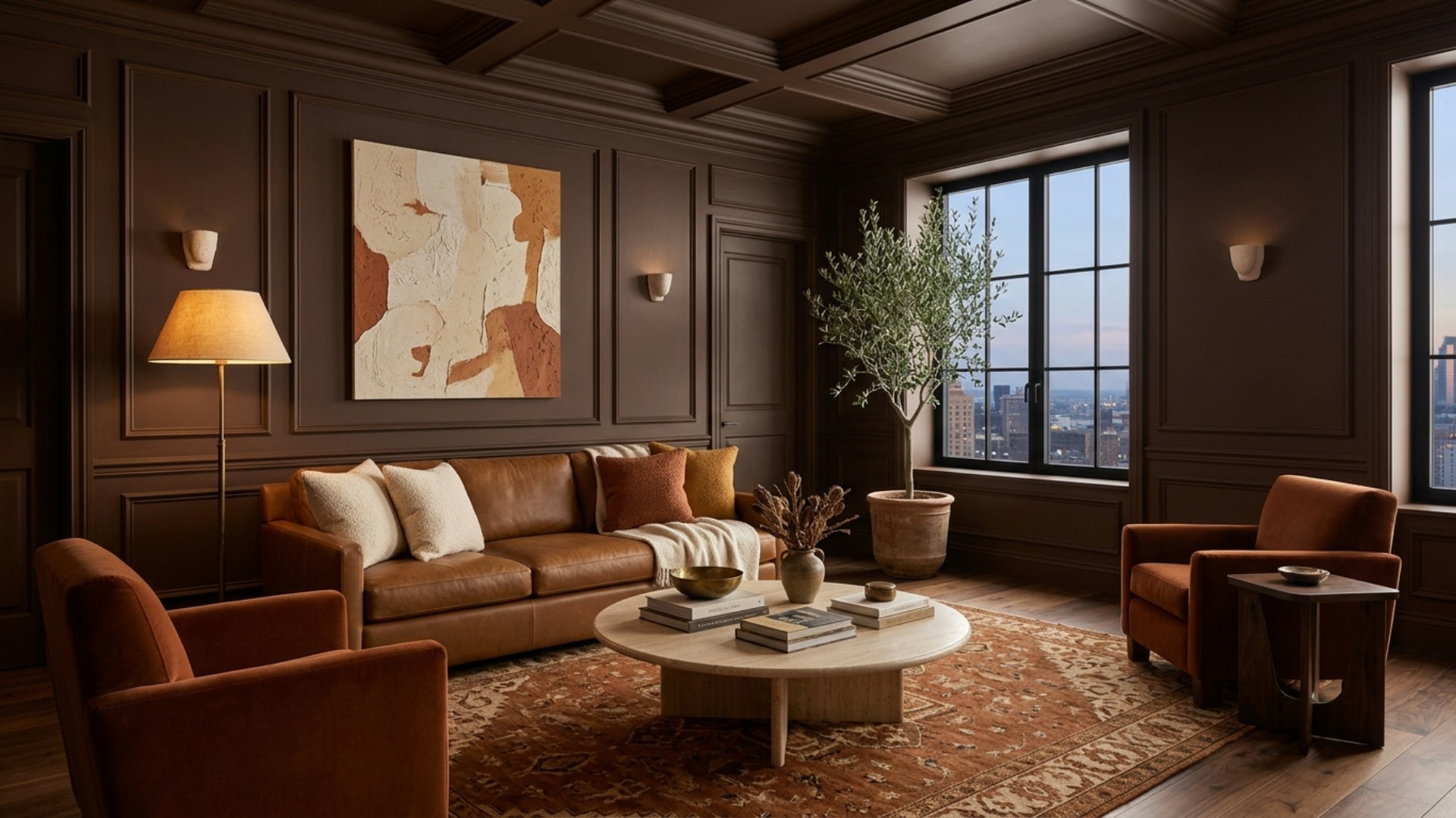
Every good palette is an ensemble, and this one has six players. Rust is the extrovert: burnt orange with the volume turned down, happiest on a velvet chair, a big piece of art, or one brave wall. Chocolate brown is the anchor, and the real headline of 2026: deep, saturated, and far more forgiving than black, it grounds everything around it the way walnut furniture always has. Mushroom is the diplomat, a soft grayed taupe that lets rust and brown talk to each other without shouting.
Then come the three that keep the room breathing. Sage brings the one cool note the palette needs, a leafy exhale between all that warmth. Taupe is the workhorse, dressing sofas and rugs in something richer than gray but calmer than brown. And cream is the light source: not stark white, which turns chilly next to rust, but the color of good linen and fresh butter. Swap your whites for creams and the whole scheme suddenly clicks.
Who Leads, Who Grounds: Building the Room
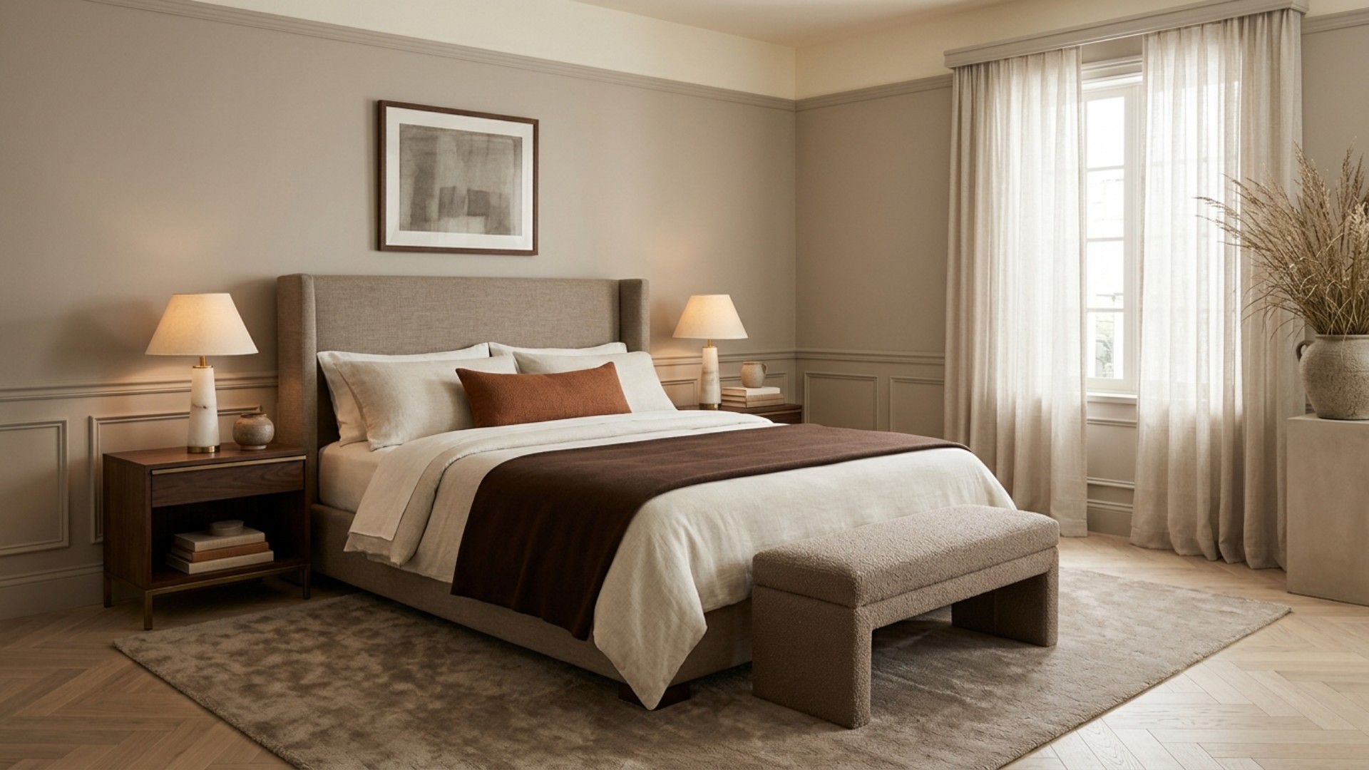
The classic 60-30-10 rule survives the warm revolution intact, it just gets recast. Give roughly 60 percent of the room to a quiet lead: cream, mushroom, or taupe on walls and large upholstery. Hand 30 percent to the grounding color, and this is where chocolate brown earns its title, in a leather sofa, a wall of cabinetry, a generous rug, or drenched across a den's four walls. The final 10 percent belongs to rust, placed in fifths around the room: two cushions, a lamp shade, a throw, a frame, a vase. Your eye travels the triangle and the room feels composed instead of decorated.
One rule keeps the whole thing honest: match undertones, not colors. Everything in this palette runs warm, so keep it that way. A blue-gray sofa or an icy white ceiling will read like a guest who came to the wrong party. Wood tones count too: walnut, oak, and teak slot in beautifully, while ashy driftwood finishes fight the scheme. If a swatch looks slightly orange, pink, or yellow at its heart, it belongs.
Warm Does Not Mean Dark: The Light Math
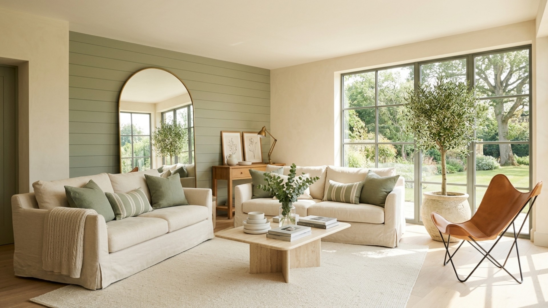
The fear that stops most people at the paint counter is that brown equals cave. But darkness and depth are different things. A saturated warm color absorbs light, yes, and then it gives it back as glow, which is precisely what gray never learned to do. The trick is to feed it. Keep ceilings and trim in cream rather than white, use matte and chalky finishes on walls so the color reads soft instead of glossy and heavy, and let texture do half the talking: boucle, linen, rush, and wool all scatter light through a warm room.
Then light it like a designer. Three layers, always: ambient overhead on a dimmer, task lamps at eye level, and one accent glow, all in warm bulbs around 2700K. A chocolate wall under cool blue-white light looks muddy; the same wall under warm light looks like the inside of a jewelry box. Add one large mirror opposite a window and even a north-facing room will carry the palette with ease.
Start Small, Then Commit
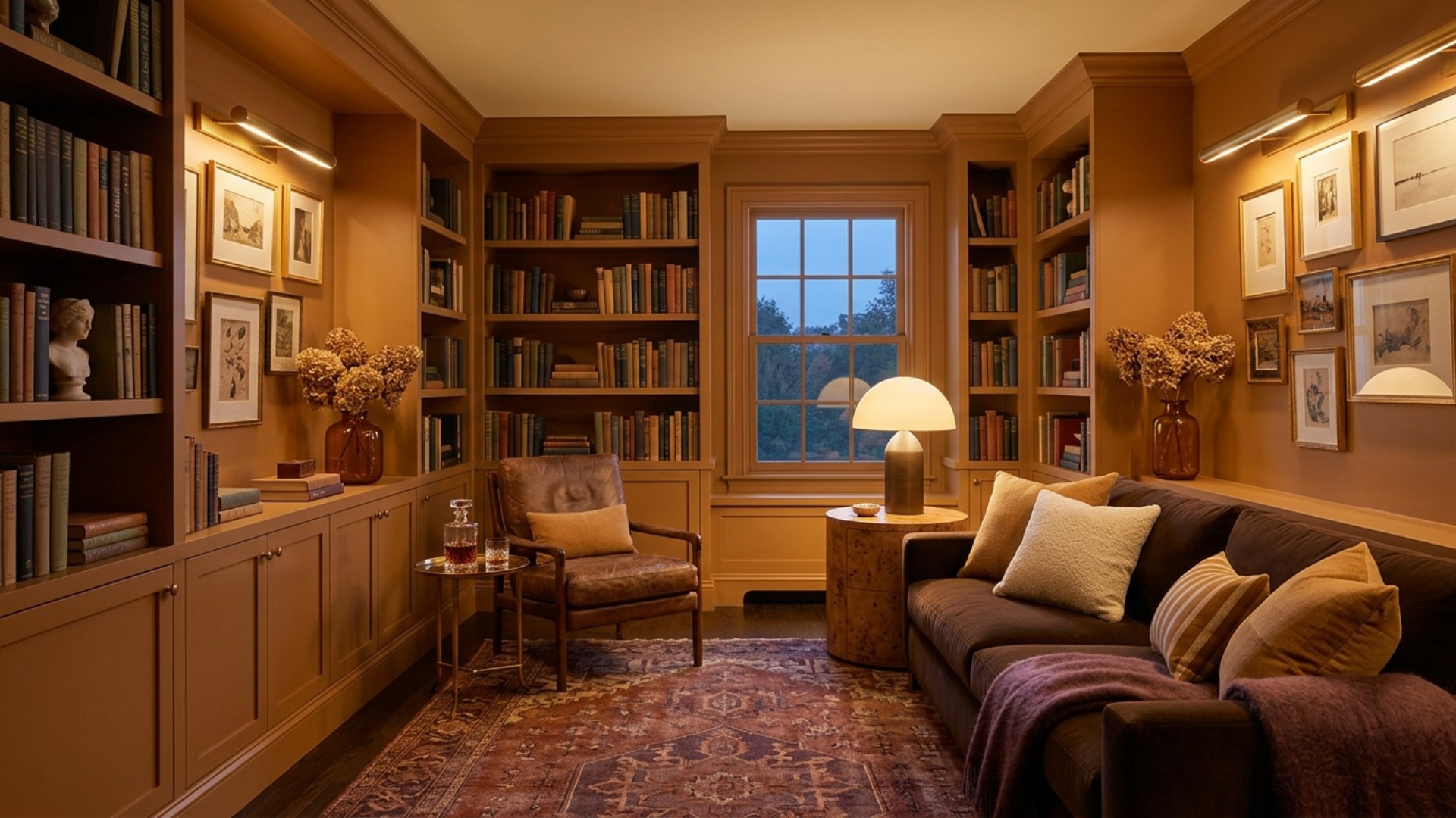
You do not have to repaint the house by Sunday. Start with the 10 percent: a rust throw, two chocolate velvet cushions, a caramel ceramic lamp. Live with it for a week and watch how the room warms up at night, which is where this palette does its best work. Then move to the 30: a rug, a chair, one wall. The full repaint comes last, once the room has already told you it wants it.
And if you would rather see the ending before you buy the first can of paint, that is exactly what Framehouse is for. Upload a photo of your room, watch it reimagined in a warm chocolate-and-rust scheme in minutes, then get the complete design playbook, with the palette, the pieces, and the plan, so you can make it real. The robots have taste now. Might as well borrow it.
See your room in 2026's warm palette with Framehouse, free to start.


