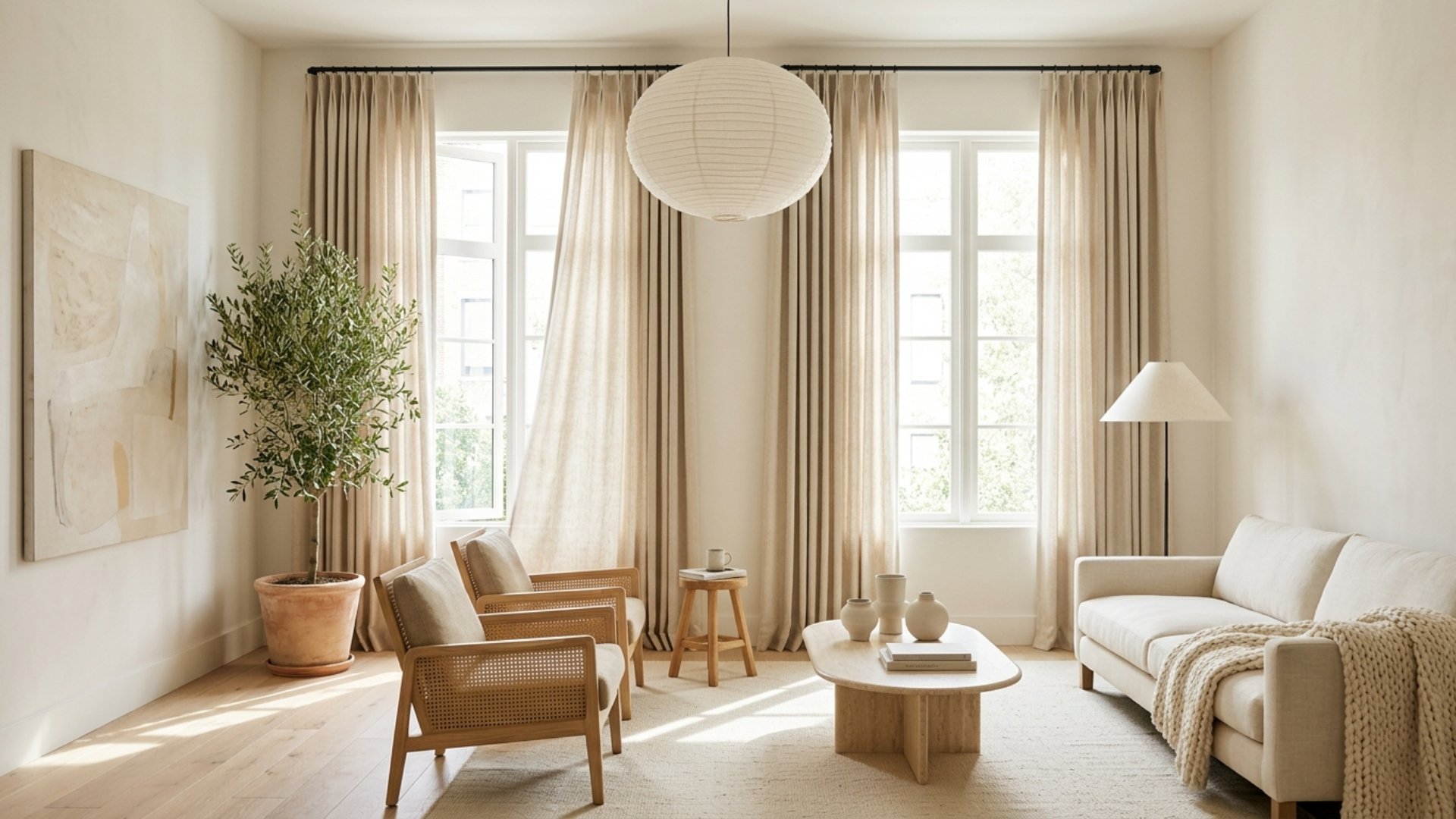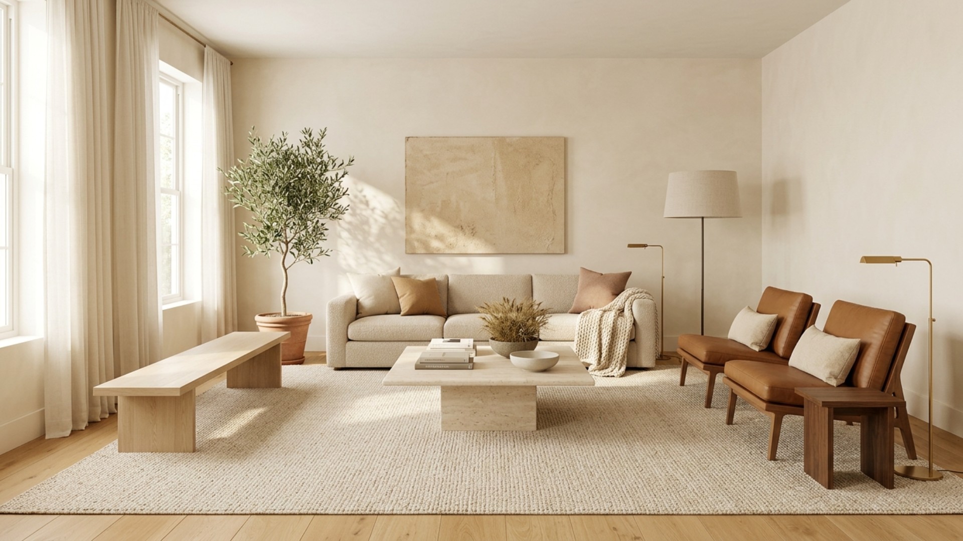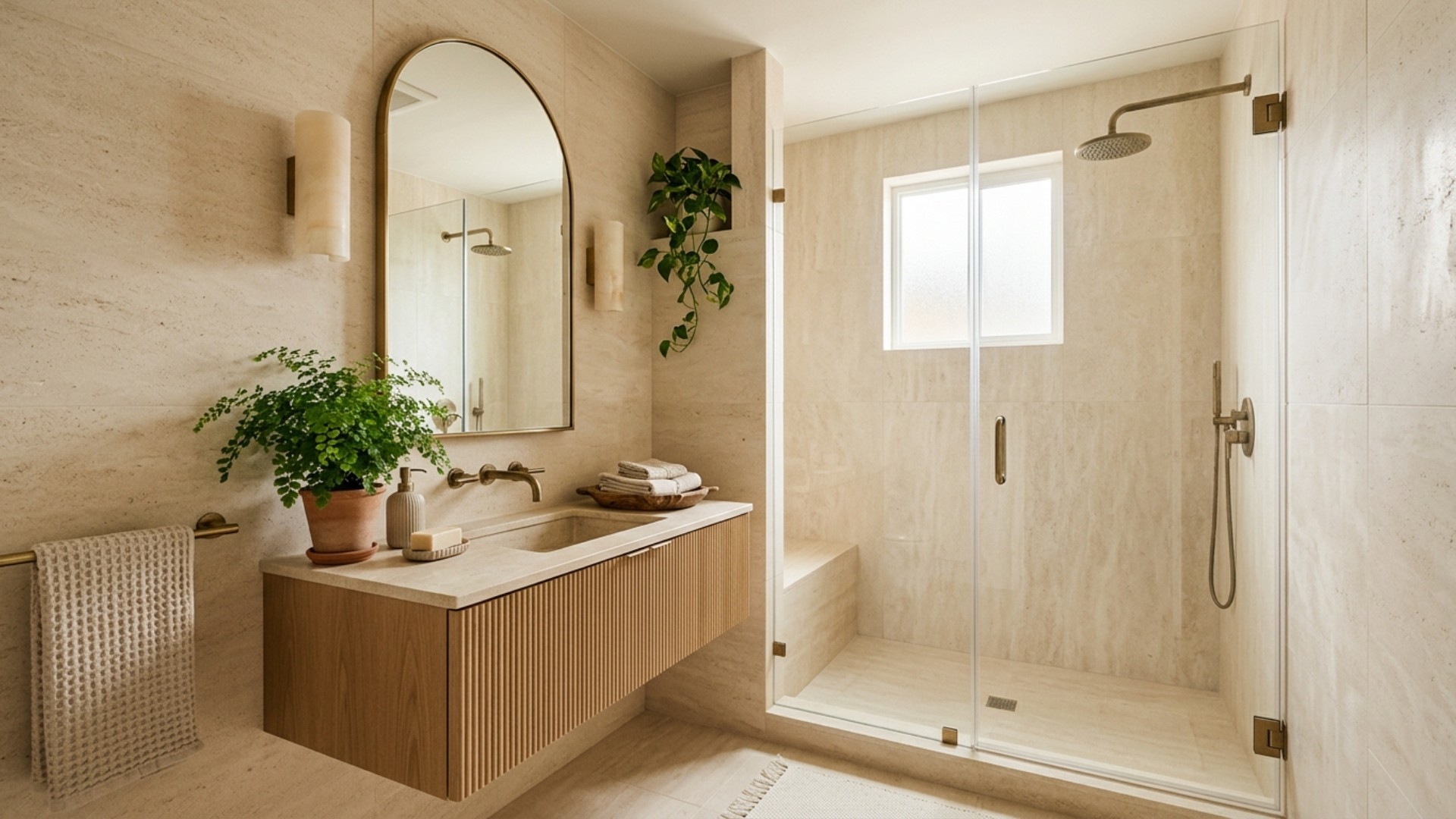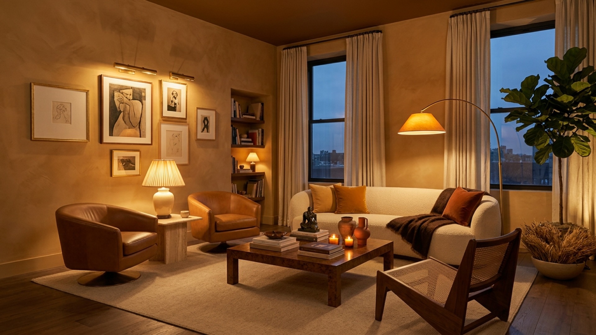
There is a particular kind of disappointment that arrives at about seven in the evening. The room looked lovely all afternoon. The sofa is the right sofa. The rug finally arrived after eleven weeks. Then the sun goes down, someone flips the switch by the door, and the whole thing turns into the waiting area of a regional airport.
That is not a decorating problem. That is a lighting problem, and it is the one most people never diagnose, because the culprit is hanging in plain sight. What follows is the rule professional designers work to without thinking about it: three layers of light, never fewer. It is the cheapest upgrade in your home, and it changes a room more than paint.
The Big Light Is the Villain of This Story
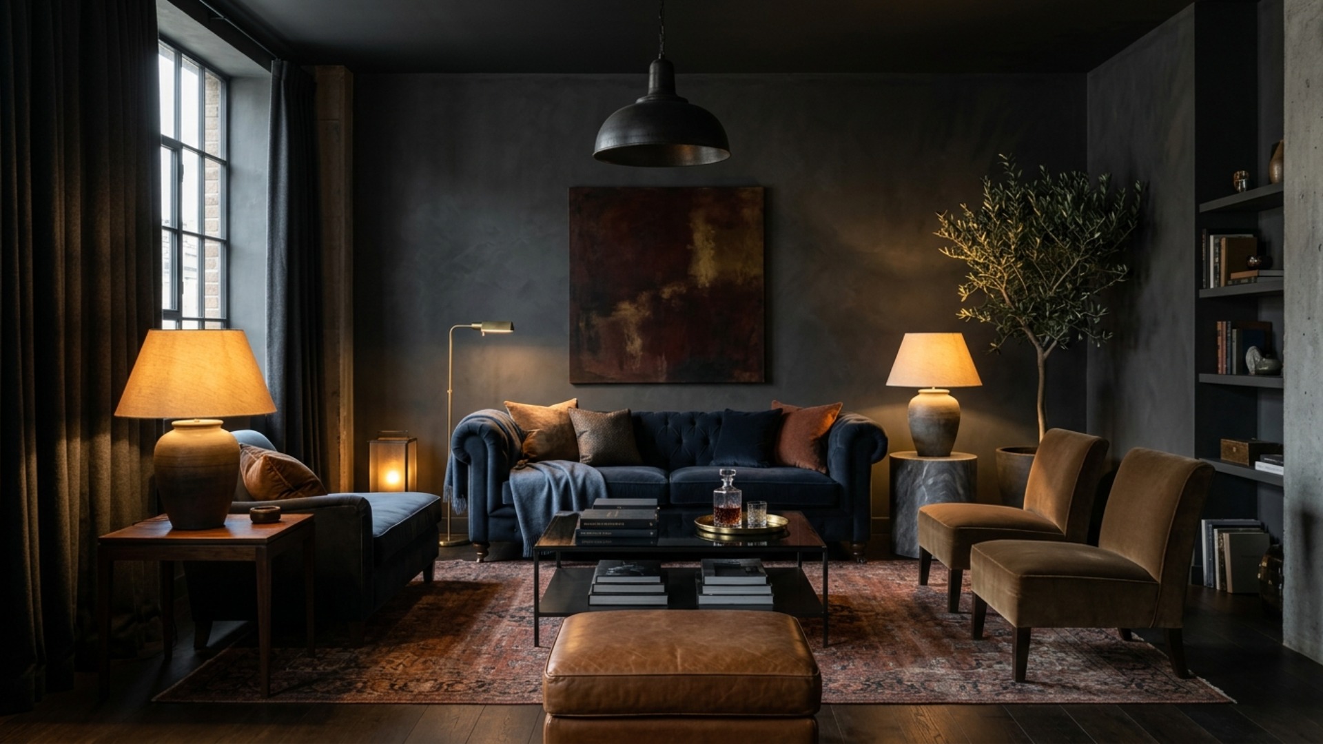
Somewhere in your ceiling there is a single fixture doing the work of five. Designers call it the big light, and switching it off is the first thing most of them would do on walking into your room.
The problem is physics rather than taste. One source mounted dead center throws light downward and evenly, which flattens every surface it touches, erases shadow, and drags faces into unflattering relief. Rooms need contrast to read as three dimensional. A lone overhead removes all of it, which is why a beautifully furnished room can still look strangely institutional after dark.
Rentals suffer worst, because the ceiling fixture is often the only thing wired in. The good news is that almost nothing in this article requires an electrician. Plugs and lamps do most of the heavy lifting.
Layer One: Ambient, the Room's Baseline
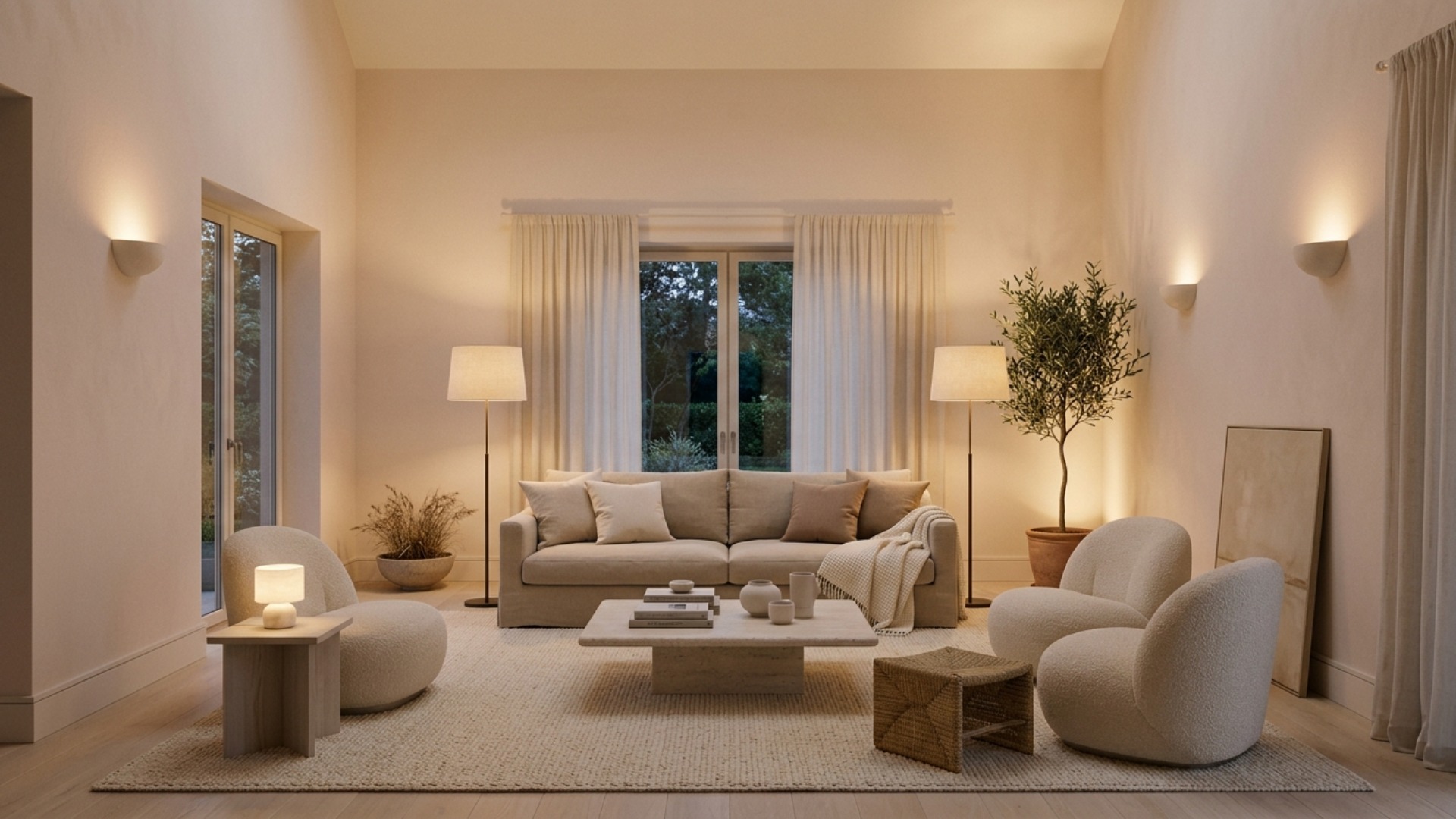
Ambient light is the general glow that lets you cross a room without barking a shin on the coffee table. It is the layer nearly everyone already has, and usually the only one, but it should not arrive from a single point.
Spread it out. A ceiling fixture on a dimmer is perfectly good as a contributor rather than a soloist, and it improves the moment you add wall sconces, a pair of tall lamps flanking the sofa, or an uplight aimed at the ceiling to bounce soft light back down. Bounced light is flattering light, because it arrives diffused rather than direct, and it makes a low ceiling feel higher than it is.
In practice, treat ambient as the wash you build the other two layers on top of, and keep it lower than instinct suggests. If the ambient layer is doing everything, the room has no depth left to give.
Layer Two: Task, the Layer That Earns Its Keep
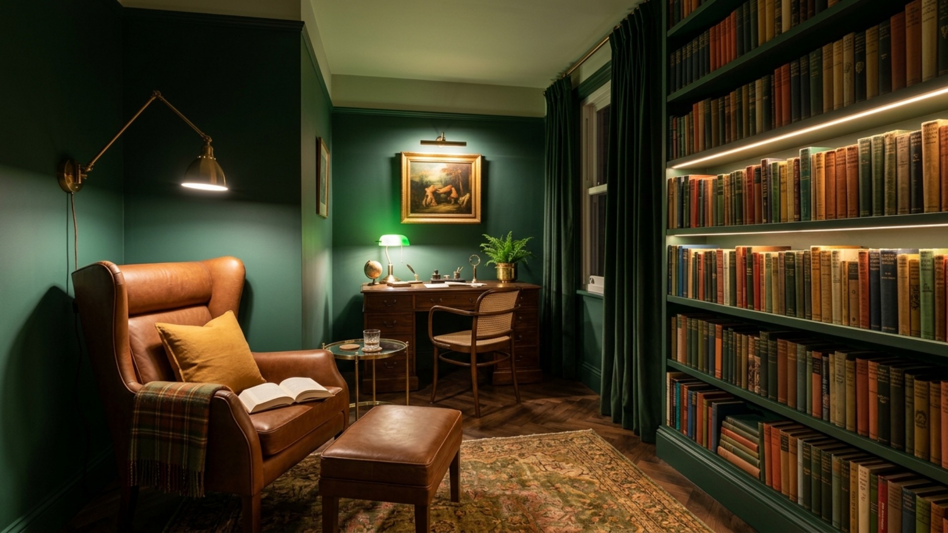
Task lighting is focused, unglamorous, and the reason a room actually gets used. It is the reading lamp beside the armchair, the strip under the kitchen cabinets that stops you chopping in your own shadow, the swing-arm sconce at the bedside, the desk lamp that saves you from squinting at four in the afternoon.
The test is refreshingly simple. Walk through the room and name every activity that happens in it. Reading, cooking, working, doing a jigsaw, putting on mascara. Each one deserves a dedicated source, positioned so the light falls on the work rather than into your eyes.
Get this layer right and a room stops being a showpiece and starts being a home. Get it wrong and you will notice soon enough, because you will find yourself doing absolutely everything at the kitchen counter, which is the only place in the house with decent light.
Layer Three: Accent, the Layer That Sells the Room
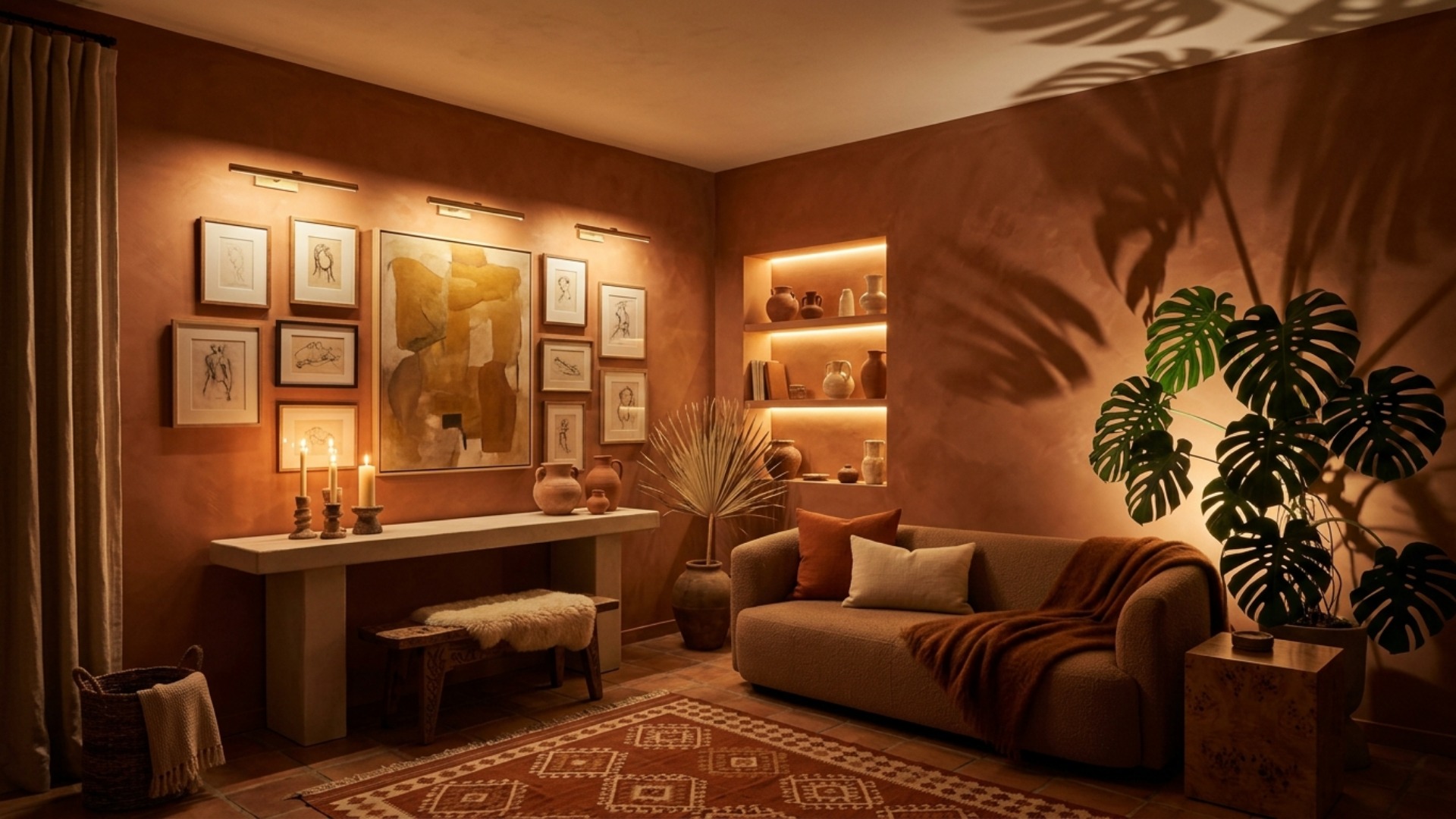
Accent lighting is the layer people skip, and the one that makes a space look designed rather than merely furnished. It has no functional job whatsoever. Its entire purpose is to create the highs and lows that the eye reads as atmosphere.
Picture lights over art. A slim uplight tucked behind a large plant so the leaves throw architecture up the wall. A warm strip inside a bookcase. A small lamp on a shelf that lights nothing in particular and is all the better for it. Candles count, and always have.
Accent is also where sculpture belongs. Lighting designers at the 2026 International Contemporary Furniture Fair leaned hard into the fixture as object: stacked forms, carved wood, exaggerated 3D-printed texture, chains treated as ornament rather than plumbing. A good fixture is beautiful switched off, which is rather the point of this layer.
The Five-to-Seven Rule: How Many Sources You Actually Need
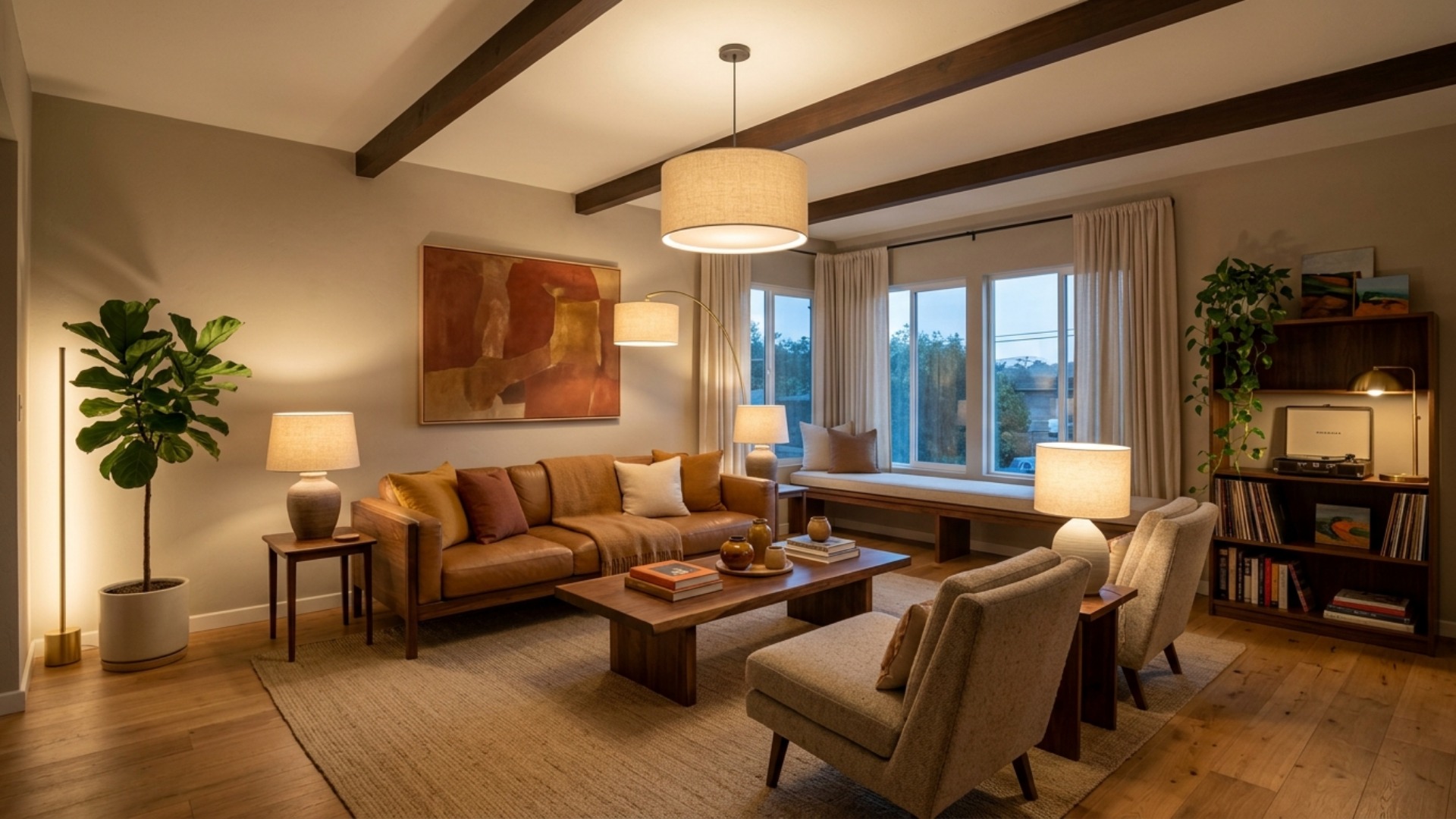
Designers work to a rough count, and it is higher than most people expect. The commonly cited figure is five to seven separate sources of light in a main living space, stretching to eight in a large room. Very few people go below five and feel good about it.
Count yours right now. If the answer is one, that is your entire problem expressed as a single number.
A workable set for an average living room: one overhead on a dimmer, two table lamps on opposite sides of the room, one floor lamp beside the seating, one uplight behind a plant, and one small accent light on a shelf or over art. That is six, and only the first requires wiring.
Spread them around the perimeter instead of clustering them in one corner. Light should arrive from several directions and several heights, which is precisely what stops a room from looking staged.
Two Numbers on the Box That Decide Everything
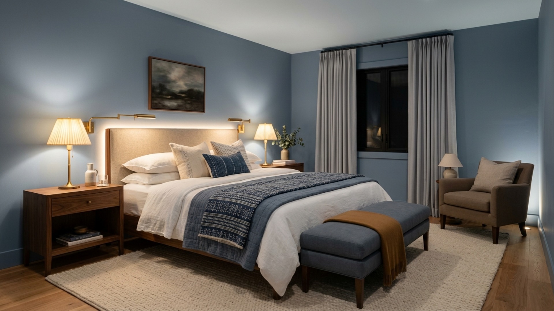
Good plans die at the bulb aisle. Two numbers matter more than the rest combined.
The first is color temperature, measured in Kelvin. 2700K is warm and intimate and the right default for living rooms and bedrooms. 3000K is a touch cleaner, pairs well with contemporary interiors, and suits kitchens and task light. Anything at 4000K or above belongs in a garage. The larger sin is mixing them: a room reads as intentional when its lamps share one temperature, and faintly chaotic when they do not.
The second is CRI, the color rendering index, a score out of 100 for how truthfully a bulb shows color against daylight. Below 90, reds go muddy, wood tones flatten, and the paint color you agonized over for a fortnight stops looking like itself. Buy CRI 90 or higher and everything you already own will look better, without you moving a single piece of furniture.
Dimmers on Everything, and the Lamp Height Nobody Measures
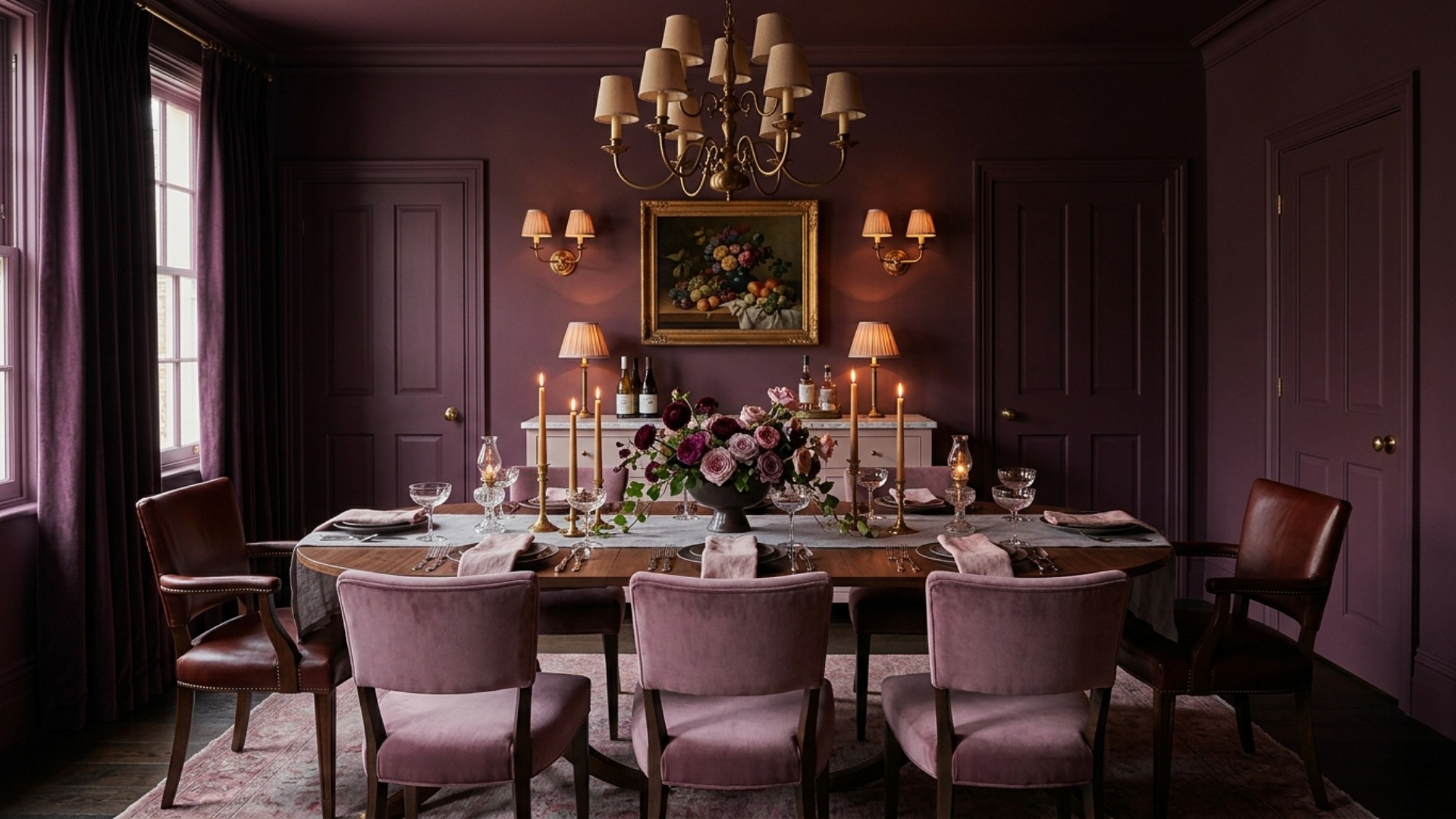
Two finishing moves separate a lit room from a designed one.
Put every layer on a dimmer, on separate controls wherever possible. A room needs a different amount of light for a dinner party than it does for finding a lost earring, and dimming is the only way to have both. Plug-in dimmer cords cost very little and require no electrician at all, which makes this the highest-return purchase in the entire article.
Then measure your lamps, because almost nobody does. The rule designers use is that the bottom of the shade should sit at roughly eye level when you are seated beside it, which lands most table lamps between 58 and 64 inches from the floor once the table underneath is counted. Since side tables tend to run 22 to 28 inches, that means a lamp of about 28 to 34 inches. Too low and you get glare straight in the eyes. Too high and you get a bare bulb and a hot spot on the ceiling.
Start With the Switch by the Door
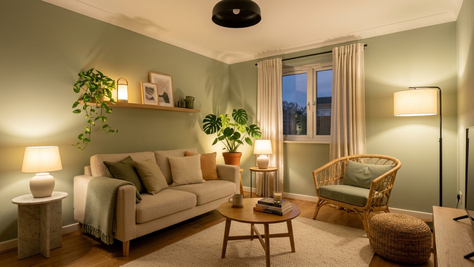
Tonight, try this. Turn the big light off. Turn on every lamp you own. Sit down and look at the room properly for a minute. You will see immediately which corners have gone dark and where the next lamp belongs, and you will have spent nothing at all.
Lighting is the rare design decision that is almost entirely reversible, which makes it the perfect place for a nervous improver to start. It is also the layer that makes everything else look more expensive, from a landlord's beige carpet to a very good sofa.
And if you would rather see how your room could look before you buy a single bulb, that is exactly what Framehouse is for. Upload a photo, watch the space reimagined in minutes, then take the full design playbook and make it real.