Modern Farmhouse Home Office Ideas for an Awkward Layout
Modern farmhouse is the one style that gets better when a room is an odd shape, because the buildings it comes from were never symmetrical either. The move is to stop hiding the awkwardness and start building into it.
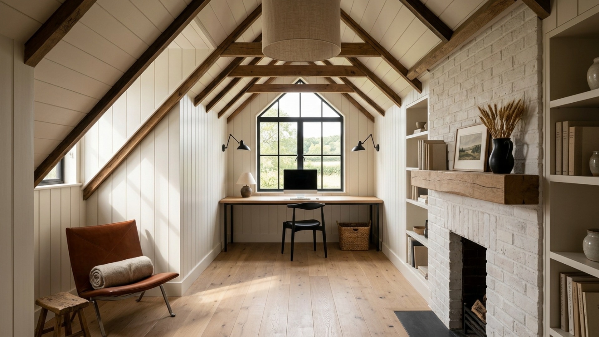
The real problem
Why this is harder than it looks
An awkward room gets treated as a problem to disguise. The corner desk comes out, shelves go up at whatever angle is left, a rug is bought to make the proportions read as squarer than they are, and the whole arrangement ends up apologising for the room. The awkwardness is still there. It is just now surrounded by furniture that does not fit either.
Modern farmhouse is worth reaching for here specifically because the buildings it descends from were never designed for symmetry. Barns, outbuildings, and additions were shaped by what they had to hold and how they were built, not by a plan drawn to be balanced. Low collar ties, off-centre openings, and a chimney landing wherever the flue needed it are the vernacular rather than mistakes. Applied honestly, the style reads an odd room as characterful, which almost nothing else does.
The home office is where this matters most, because it is nearly always the leftover room. The long narrow one at the end of the landing, the space under a sloping roof with 1.4m of headroom at the eaves, the bedroom with a chimney breast eating the middle of the only wall long enough for a desk, or the room whose door swings straight into the spot where a chair needs to go.
The specific failure is trying to centre things. Centring a desk on a wall that has a chimney breast in it gives you two dead corners and a working position that fights the light. Centring anything under an eave produces a desk you cannot sit at. The alternative is to stop centring and start filling: run the desk the full width of the wall it is on, build joinery into the leftover corners, and let the asymmetry become architecture rather than an oversight.
A clear path
How to plan it
-
01
Measure the constraints that actually decide the layout
Before anything is bought, record five numbers: the ceiling height at the lowest point you would sit under, the door swing arc, the height of the window sill, the position of every socket, and the depth of the chimney breast or bulkhead. You need about 1.5m of headroom to sit comfortably under a slope and roughly 90cm of clear floor behind a desk chair. Most awkward-room mistakes are one of those five numbers being assumed rather than measured.
-
02
Run the desk the full width of the wall rather than centring it
A desk that spans wall to wall turns an odd dimension into a deliberate one, and it gives you far more usable surface than a freestanding desk in the same room. A 40mm solid oak or oak-veneer top at 60 to 70cm deep on slim blackened steel legs or a simple painted cleat does the job, and an IKEA Karlby countertop cut to length is the low-cost version of exactly the same idea. Put it under the window if the window is on the short wall.
-
03
Fill the dead corners with joinery painted the wall colour
The alcoves either side of a chimney breast, and the low triangle under a slope, are the parts everyone leaves empty and then resents. Built-in shelving or low cupboards in painted MDF, finished in the same colour as the walls, absorb that space and make the irregularity look intentional. Benjamin Moore White Dove OC-17 and Farrow and Ball Pointing are both reliable warm whites for this, and painting joinery and wall the same shade is what stops the room reading as busy.
-
04
Put the black on the geometry, not on the walls
Modern farmhouse gets its structure from black lines rather than from dark surfaces, which is useful in a room with strange angles because the lines can be used to explain the shape. Black window frames, two matte black articulated wall sconces above the desk, black chair legs, and black cabinet hardware are enough. A black feature wall in an awkward room does the opposite, flattening the geometry you are trying to make legible.
-
05
Visualize it in Framehouse before you commission any joinery
Built-in work is the one part of this you cannot undo, and an awkward room is exactly where a drawing is hardest to read. Upload a photo of the room as it stands and generate the modern farmhouse version with the desk run and the alcove joinery in place. It is the fastest way to find out whether the full-width desk actually looks right before a joiner quotes for it.
Built for awkward layout
Moves that pay off
An awkward room rewards planning far more than a regular one, because there is less room for a mistake to hide in.
- Work out the seating position first and design everything else around it. In an odd room the one comfortable working spot is usually not where you would guess.
- Build to the walls. Freestanding furniture in an irregular room leaves gaps that read as leftover space rather than as breathing room.
- Use one continuous horizontal line, usually the desk top, to tie the walls together. It does more for the proportions than any amount of rearranging.
- Deal with the door swing early. A door that opens into the room can often be rehung to open the other way for very little money, and it can release the only usable corner.
- Do not buy a corner desk. They are sold as the solution to awkward rooms and they waste the corner while putting you at an angle to the light.
- Light the low or dark end deliberately, with a wall or task light rather than a ceiling fitting, or that end will read as unusable no matter what you put there.
modern farmhouse cues
What to keep, what to skip
Modern farmhouse has drifted a long way from the buildings it started in. Keeping it credible is mostly about restraint and honest materials.
- Palette: warm white walls and joinery, natural mid-tone wood, matte black on frames and hardware, and one warm accent. Cognac leather and aged terracotta both work well.
- Wood: rift-sawn or plain white oak, reclaimed timber for structural elements, satin finish. Avoid orange-toned pine and heavy artificial distressing.
- Structural signature: a visible structural element left honest, an exposed collar tie, a beam, or a real shiplap wall run in one direction only.
- Materials: whitewashed brick, painted MDF joinery, linen shades, rush and woven baskets, unglazed pottery.
- Black is a line, not a surface. Use it on window frames, sconces, and hardware, and keep it off large areas.
- Skip: shiplap on all four walls, sliding barn doors indoors, script wall signs, galvanised everything, and faux distressed finishes.
Use it for
What people plan with Framehouse
- See whether a full-width desk suits an odd wall
- Test alcove joinery before a joiner quotes for it
- Check the headroom under a sloped ceiling for a desk
- Compare warm white joinery against your existing floor
- Show a builder what you actually want built
Quick answers
Common questions
Make a plan you can act on
Skip the spiral of mood boards. Three minutes in the Aura Quiz turns your taste into a direction.
Take the Aura Quiz