Mid Century Modern Studio Apartment Ideas for an Awkward Layout
Mid century modern furniture was designed for open plans with odd corners, which makes it unusually good at rescuing a studio that does not want to be one room. This page shows how to use that to fix a layout that currently fights you.
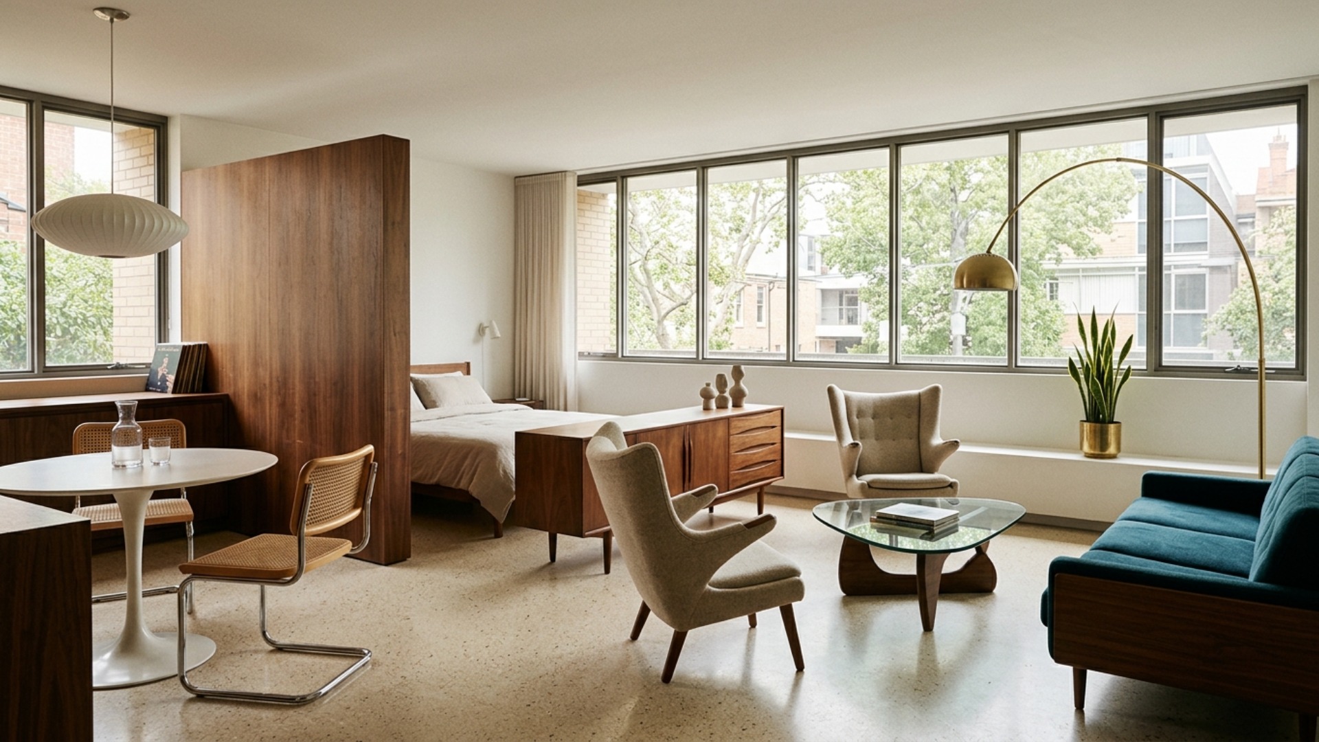
The real problem
Why this is harder than it looks
The instinct in an awkward studio is to push everything flat against the walls. It feels like the safe move, since it clears the middle and makes the floor look bigger in a photograph. What it actually does is turn the room into a corridor with furniture stuck to the sides, and it makes every strange angle in the plan more obvious rather than less, because there is nothing in the room drawing the eye away from the walls.
Mid century modern is a genuinely useful answer here, and not for the reason people usually give. It is not the tapered legs. It is that the furniture was designed for open plan living at a moment when open plan was new and nobody had figured out walls yet. Pieces from that period are finished on all four sides, sit low, and stand on legs, so they can float in a room without looking like they came adrift. A Danish sideboard has a proper back. A modern flat pack one usually does not.
The awkwardness in a studio is almost always one of three things: a long narrow rectangle, an L with a stub you cannot use, or a room with the door, the window, and the radiator all competing for the same wall. Each of these has a different fix, and the first job is naming which one you actually have rather than treating awkward as a general condition.
The failure pattern is solving it with storage. A tall unit gets added to fill the odd corner, then a second one on the opposite wall to balance it, and the room ends up shorter, darker, and no better organised. Low and long beats tall and narrow almost every time in a studio, because the horizontal line is what makes an awkward plan read as deliberate.
A clear path
How to plan it
-
01
Name the specific awkwardness before you move any furniture
Measure the room and write down the actual problem in one sentence: the room is 22 feet by 10 and reads as a hallway, or there is a four foot stub off the main rectangle that nothing fits in. Vague awkwardness leads to vague solutions. A narrow room needs the furniture turned across the width, while an L-shaped plan needs the stub given a single defined job rather than being treated as leftover space.
-
02
Float the sofa and let it draw the boundary
This is the move that fixes most awkward studios and the one people resist longest. Pull the sofa off the wall and set it perpendicular, with its back facing the sleeping area, and the room instantly reads as two zones rather than one confused one. Mid century sofas are the right tool because they are low, they are finished at the back, and they sit on legs so light travels underneath. Leave at least 24 inches of walkway behind it.
-
03
Give the leftover corner one clear job
The stub in an L-shaped studio fails when it becomes general storage. Assign it a single function instead: a desk with a Cesca chair, a reading corner with an arched floor lamp and one armchair, or a small round tulip table for eating. One purpose, two or three pieces, nothing else. A corner with a job looks intentional, and a corner with three jobs looks like the place where things end up.
-
04
Use one long low credenza instead of several tall units
A walnut credenza around six feet long and under 30 inches high will hold more than two tall bookcases and will make the room feel wider rather than shorter. Run it along the longest uninterrupted wall, or use it as the divider behind the floated sofa. This is the single most useful piece of furniture in a mid century studio, and it is worth spending more on than almost anything else in the room.
-
05
Test the layout in Framehouse before you move anything heavy
Furniture placement is the hardest thing to judge from a floor plan, and in an awkward studio it is also the thing you cannot easily undo once a sofa is upstairs. Photograph the room from the doorway, run the mid century modern direction, and look at the floated sofa and the credenza in position before you commit. It costs nothing to find out that the walkway is too tight.
Built for awkward layout
Moves that pay off
An awkward layout is a geometry problem, and most of the fixes are free. They are about placement rather than purchase.
- Solve the walkway first. A clear path from the door to the window, at least 30 inches wide, matters more than any arrangement that looks better on paper.
- Turn furniture across a narrow room rather than along it. Two facing chairs placed across the width break the corridor effect immediately.
- Use a rug to state each zone, and size it so the front legs of the seating sit on it. An undersized rug makes an awkward room look more scattered, not less.
- Do not put anything tall in a sightline from the door. Keep the tallest object in the room at the far end, where it terminates the view instead of blocking it.
- Leave one corner deliberately empty. An awkward room needs somewhere for the eye to rest, and a plant does not count.
- Live with the arrangement for two weeks before buying anything to complete it. Awkward rooms reveal their real problem only once you are moving through them daily.
mid century modern cues
What to keep, what to skip
Mid century modern is easy to over-apply. The aim is a room that borrows the proportions and the wood, not a period set.
- Palette: walnut or teak as the anchor, warm cream or oatmeal as the field, and one saturated accent such as petrol blue, olive, or mustard used on a single piece.
- Materials: oiled walnut and teak with visible grain, cane webbing, wool boucle and tweed, brushed brass, and terrazzo or cork underfoot.
- Structural signature: legs. Sofas, credenzas, and chairs all lift off the floor, and that continuous sliver of visible floor is what makes a small awkward room feel larger.
- Proportion: low and long. Keep the horizontal line unbroken across the longest wall and let one sculptural lamp be the only tall element.
- One statement, not five: a Bubble pendant or an arched floor lamp will carry the room. Two of them compete.
- Skip: a full room of reproductions, starburst clocks, orange and brown together, and anything sold as a mid century set. The style works best mixed with plain modern pieces.
Use it for
What people plan with Framehouse
- Test whether a floated sofa still leaves a usable walkway
- See how a long low credenza changes the proportions of a narrow room
- Try a desk in the awkward corner before buying one that fits
- Compare walnut against your existing floor colour
- Show a partner two zoning options for the same studio
Quick answers
Common questions
Make a plan you can act on
Skip the spiral of mood boards. Three minutes in the Aura Quiz turns your taste into a direction.
Take the Aura Quiz