Minimalist Home Office Ideas Using Only IKEA
IKEA is genuinely good at minimalism, and genuinely bad at the part everyone gets wrong: restraint in the cart. This page shows how to build a calm, quiet home office out of a catalogue most people over shop.
The real problem
Why this is harder than it looks
The reason an all IKEA minimalist office usually misses is not quality. It is that IKEA sells minimalism as a set of products rather than as a discipline, and the store layout rewards adding. You walk in for a desk and leave with a desk, a shelf unit, a drawer cart, three boxes, a rug, a lamp, and a plant pot. Every item is defensible on its own. Together they are the opposite of minimal.
Real minimalism is subtractive and it is mostly about surfaces and lines. A minimalist room reads calm because there are very few visual breaks: one continuous horizontal line where the storage runs, one material doing most of the work, and almost nothing sitting out. IKEA can deliver all of that, because flat fronted handleless fronts and long uninterrupted worktops are exactly what it is best at. What it cannot do is stop you buying the seventh thing.
Your specific constraint makes this harder in one way and easier in another. Sticking to one retailer means the finishes will match, which is genuinely useful for a look that depends on continuity. It also means everything will be recognisably IKEA, and the standard failure is a room that reads as a showroom vignette rather than a room somebody lives in.
The failure pattern is buying storage before you know what you own. Two Kallax units arrive, you fill them because they are there, and now the room has thirty two visible compartments in a style that depends on hiding things. Storage should be the last decision, sized to what actually survives an honest cull, and closed rather than open almost every time.
A clear path
How to plan it
-
01
Empty the room and cull before you open the app
Everything that comes back in has to earn a place, and everything that does not gets a decision now rather than a box later. This is free, it takes an afternoon, and it is the only step that reliably shrinks the shopping list. Most people discover they need about half the storage they were about to order.
-
02
Buy one long worktop instead of a desk
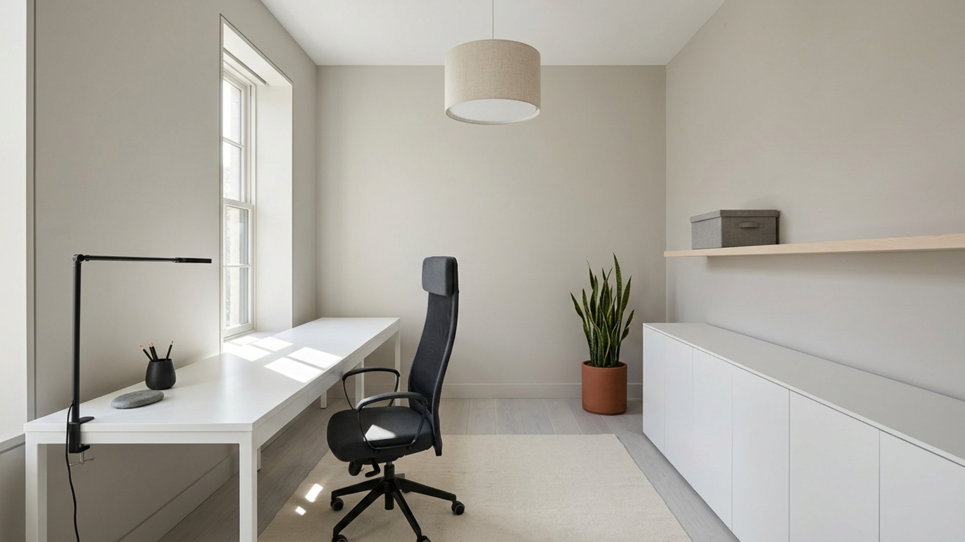
A KARLBY or LAGKAPTEN top on ALEX drawer units or ADILS legs gives you a continuous horizontal plane, which is the single strongest minimalist move available for under $250. A standalone desk breaks the wall into three shapes. A run of worktop reads as one. Go as long as the wall allows and resist the urge to centre it.
-
03
Choose handleless fronts and one wood tone, then stop
Pick either the white lacquer family or the light oak effect family and stay inside it for every cabinet, shelf, and drawer front. Mixing METOD white with a birch BILLY and a black KALLAX gives you three materials in a style that wants one. Handleless fronts matter more than people expect, because handles are the thing that makes a wall of storage read as furniture rather than as architecture.
-
04
Hide the cables properly, not partially
Cable clutter destroys minimalism faster than any furniture choice, and a half solution is worse than none. Use a SIGNUM tray under the worktop, a single power strip inside it, and route one visible cable down a leg. Budget an hour and about $40 for this. It is the difference between a calm desk and a desk with a nest under it.
-
05
See the finished room before the flat pack arrives
IKEA rooms are hard to imagine from product photos, because everything is shot against a white cyclorama and your room is not white or empty. Photograph the actual space, run it through Framehouse in a minimalist direction, and test the long worktop against your real wall length and window position. Returns at IKEA are a genuine ordeal, so this is worth the ten minutes.
Built for ikea only design
Moves that pay off
One retailer is a constraint worth using rather than apologising for. IKEA is strong on continuity and weak on personality, so lean into the first and solve the second deliberately.
- Build the room around the kitchen and wardrobe ranges rather than the office aisle. METOD and PAX give you flat handleless fronts and full height storage that the desk range cannot match.
- Buy the chair last and be willing to break the rule for it. A chair is the one item you sit in for eight hours, and it is a reasonable place to spend outside the catalogue if nothing fits.
- Skip the styling props entirely. The vases, faux plants, and decorative boxes are where the showroom look comes from.
- Swap the legs or the top on one piece to break the pattern. A different worktop on standard drawer units costs little and stops the room reading as a page from the catalogue.
- Assemble in the order storage, worktop, lighting, seating. Reversing that leaves you working around a chair for two weekends.
- Buy one spare of any small part you use more than twice, because ranges get discontinued and matching later is close to impossible.
modern minimalist cues
What to keep, what to skip
Minimalism is a set of restrictions rather than a shopping category, and these are the ones that hold whatever you spend.
- Palette: one warm neutral for walls, one wood tone, one dark for hardware and the chair. Three values in total, no more.
- Materials: matte white lacquer, pale birch or light oak effect, brushed or anodised aluminium, honed concrete, unbleached cotton. Everything low sheen.
- Storage is closed by default. Open shelving is allowed in exactly one place, and whatever sits on it should be worth looking at.
- The structural signature is a single uninterrupted horizontal line: worktop, or cabinet run, or floating shelf, carried across the full wall rather than stopped short.
- One accent, one object. A clay terracotta pot or a single dark ceramic is enough, and adding a second immediately halves the effect of the first.
- Skip the empty for its own sake version. A minimalist room with nowhere to put your headphones is not minimal, it is unfinished, and you will end up piling things on the worktop.
Use it for
What people plan with Framehouse
- Check whether a long worktop actually fits your wall before ordering it
- Compare a white lacquer scheme against a light oak one in your own light
- See how much storage the room needs once you have culled
- Show a partner or roommate what shared minimal means in practice
- Decide whether the room can take a dark accent wall or needs to stay pale
Quick answers
Common questions
Make a plan you can act on
Skip the spiral of mood boards. Three minutes in the Aura Quiz turns your taste into a direction.
Take the Aura Quiz