Minimalist Kitchen Ideas for a Luxury Upgrade
Minimalism at the top end is not about owning less. It is about paying for the parts nobody will ever see, so the parts they do see have nothing to argue with. This page shows where the money actually goes in a minimalist kitchen upgrade, and which of the expensive moves you can skip without anyone noticing.
The real problem
Why this is harder than it looks
The usual misreading is that a minimalist kitchen is an empty one. So the upgrade starts by taking things away: the open shelving goes, the handles go, the cabinets get replaced with flat white slab doors, and the result is a room that feels less like a Vincent Van Duysen interior and more like a corridor in a serviced apartment. Nothing is wrong with it. Nothing is right with it either.
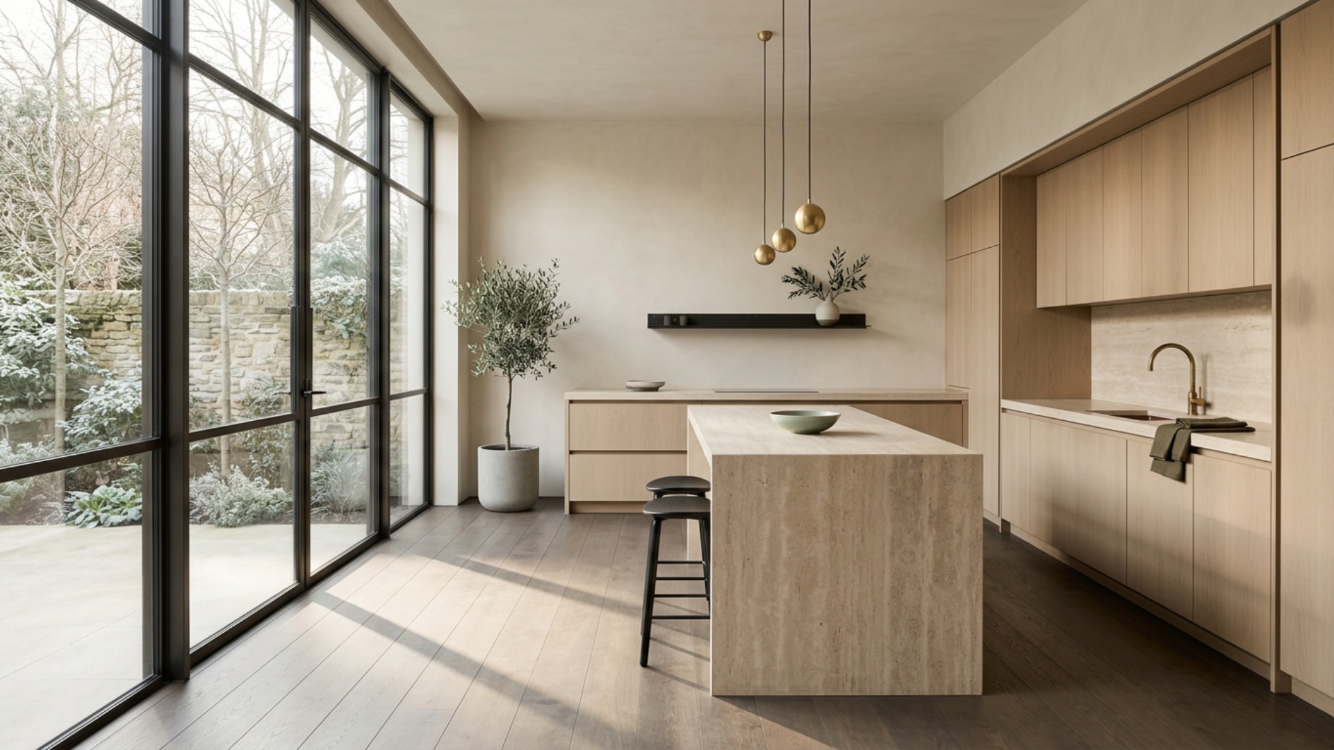
What is actually happening in the kitchens you saved is not subtraction, it is control. Every line in the room either runs the full length of a wall or stops on purpose. The gap between a door and its neighbour is the same three millimetres everywhere, top to bottom. The counter meets the wall without a scribe bead. The extraction is silent because it was ducted properly, not because it was hidden. None of that is a purchasing decision. All of it is a fabrication and installation decision, which is exactly why it costs money and exactly why it never shows up on a mood board.
You are almost certainly starting from a kitchen that works. The dishwasher runs, the layout is fine, nobody is unhappy with where the sink sits. That is a very different problem from a gut renovation, and it is a better one. It means the money is free to go into surface quality and precision rather than into moving drainage. It also means the temptation is to shop rather than to plan, because shopping produces visible progress and planning produces a drawing.
The failure pattern from here is predictable. The budget goes to a Wolf range, a Sub-Zero column and a slab of Calacatta Viola, and the cabinet run, the ceiling and the lighting stay exactly as they were. You end up with three expensive objects sitting in an ordinary room, which reads as spending rather than as design. Minimalism is unforgiving that way. It removes the ornament that would otherwise cover for a mediocre background, so the background has to be good first.
A clear path
How to plan it
-
01
Audit the lines before you touch a single finish
Stand at the door and photograph the kitchen straight on, then draw over the photo and mark every horizontal that stops before it should: a counter that dies into a wall, a cabinet run that steps down for no reason, a bulkhead that ends mid-wall. Those broken lines are what make a room read as busy, and fixing them is usually joinery and plasterwork rather than new appliances. Do this before you spec anything, because it will change what you buy.
-
02
Put the money in the joinery, not in the door front
A handleless door is only as good as its reveal, and a reveal is only as good as the carcass it is fixed to. Ask any fabricator quoting you for a fixed shadow gap of three to four millimetres held consistently across the whole run, an 18mm or thicker carcass, and Blum or Hettich soft-close hardware as standard. A painted MDF door on a well built carcass with a true reveal will out-photograph a veneered door on a sloppy one every time, and it costs less.
-
03
Choose one stone and repeat it everywhere it can go
The single fastest way to make a minimalist kitchen look expensive is to use one material in three places: the counter, a full-height splashback, and a mitred waterfall end on the island. Honed rather than polished, because polish shows every fingerprint and reads as builder-grade under downlights. If a real slab is out of reach, Neolith or Dekton in a quiet limestone tone holds up better than a busy quartz pretending to be marble.
-
04
Bury the appliances, the sockets, and the extraction
Integrated fridge and dishwasher fronts are the obvious part. The part people skip is power: move every countertop socket into the underside of the wall cabinets or into a pop-up in the island, and the back wall goes quiet immediately. For extraction, a ceiling recessed unit or a downdraft costs more than a chimney hood but removes the largest visual object in the room, which is usually worth more than the equivalent spend on a range.
-
05
Light it in three layers and put every layer on a dimmer
One grid of downlights is the reason most minimalist kitchens look clinical at night. Run a warm 2700K LED strip in the shadow gap under the wall cabinets for the work surface, add two or three low pendants over the island for the eye, and keep the ceiling lights narrow beam and few. Every circuit on a dimmer, ideally a Lutron or equivalent scene keypad, so the room can drop from cooking to sitting without you touching anything.
-
06
See the finished kitchen before you commit the deposit
Stone and paint are close to impossible to judge from a sample the size of a postcard, and a minimalist room lives or dies on whether the warm white you chose actually reads warm against your floor. Photograph the kitchen as it is and run it through Framehouse to see the same room in honed limestone against pale oak, or in bone microcement, before the fabricator cuts anything. It is a twenty minute check against a decision you will live with for fifteen years.
Built for luxury upgrade
Moves that pay off
A luxury upgrade is a different job from a renovation. The layout already works, so every pound is discretionary, which means the sequencing matters more than the shopping list. These are the moves that repay the spend.
- Get the joinery quoted before the appliances. The cabinet run is the biggest visual surface in the room and the hardest thing to fix later, so it should set the budget rather than absorb what is left.
- Replace the worktop and the splashback in the same order, from the same slab. Doing them in two phases almost always produces two slightly different stones.
- Defer the flooring unless it is actively wrong. New floors are disruptive, expensive, and the least noticed change in a kitchen upgrade.
- Do not buy the range first. A commercial-look range is the single most style-specific object you can commit to, and it will fight a minimalist scheme rather than serve it.
- Budget for a proper electrician's day to move sockets and add circuits. It is the cheapest line item that produces the most visible calm.
- Keep one warm material in the room, usually the floor or a single oak element. A fully hard-surfaced minimalist kitchen photographs beautifully and is unpleasant to stand in.
modern minimalist cues
What to keep, what to skip
Minimalist is the strictest of the modern styles because there is nothing to hide behind. It rewards precision and punishes approximation, so the cues are mostly about restraint held consistently rather than about specific products.
- Palette restricted to three tones maximum, usually a warm off-white, one mid neutral, and one near-black. Benjamin Moore White Dove or Farrow and Ball Shadow White are safe warm whites that do not go blue under LED.
- One focal material carried across counter, splashback and island end, honed rather than polished.
- Handleless fronts with a true shadow gap, not a J-pull routed into the door. The J-pull is the compromise version and it reads as one.
- Full-height tall banks that run wall to wall and floor to ceiling, so the eye has no interrupted edges to catch on.
- One metal only, and let it age. Unlacquered brass or blackened steel, used on the tap and nothing else.
- Skip open shelving, glass-front cabinets, and decorative tile. All three ask the room to be styled continuously, which is the opposite of what you are buying.
Use it for
What people plan with Framehouse
- Test a warm off-white against your existing floor before ordering paint
- Compare honed limestone and pale oak fronts in your actual kitchen
- Show a fabricator what you mean by a shadow gap reveal
- Decide whether the island should be waterfall or open-ended
- Show a partner what the room looks like without the chimney hood
Quick answers
Common questions
Make a plan you can act on
Skip the spiral of mood boards. Three minutes in the Aura Quiz turns your taste into a direction.
Take the Aura Quiz