Mid Century Modern Living Room Ideas for an Open Plan Layout
Open plan rooms fail for the same reason every time: nothing tells you where the living room stops. Mid century furniture was designed for exactly this problem, and this page shows how to use it to draw the lines a builder left out.
The real problem
Why this is harder than it looks
The complaint about open plan is almost never that the space is too big. It is that the living area has no edges, so it feels like a waiting room attached to a kitchen. Sound carries, the television is audible from the hob, and there is nowhere that reads as a place to sit rather than a place to pass through. The room is not underfurnished. It is undefined.
Mid century modern is the obvious answer and it is worth being precise about why, because the usual explanation is just aesthetic. Postwar architects were the first people to build houses without interior walls at scale, and the furniture of that period was designed in direct response. Sofas got backs that were meant to be seen. Credenzas got finished rear panels. Room dividers became a category of furniture rather than a construction detail. These are tools for exactly this problem, not just a look that happens to suit it.
Most open plan living rooms sit at one end of a long rectangle that also holds a dining table and a kitchen run. The awkward part is usually the transition: a stretch of floor between the sofa and the table where nothing happens and everything feels temporary. That gap is the real problem, and it is fixable without moving a single wall.
The failure pattern is pushing the sofa against the outside wall to keep the middle clear. It feels generous and it produces the opposite of what you want, because the living zone loses its boundary entirely and the empty middle becomes a corridor everyone walks through. The fix is to bring the furniture inward and let the back of the sofa do the job the missing wall used to do.
A clear path
How to plan it
-
01
Float the sofa and give the living zone a back edge
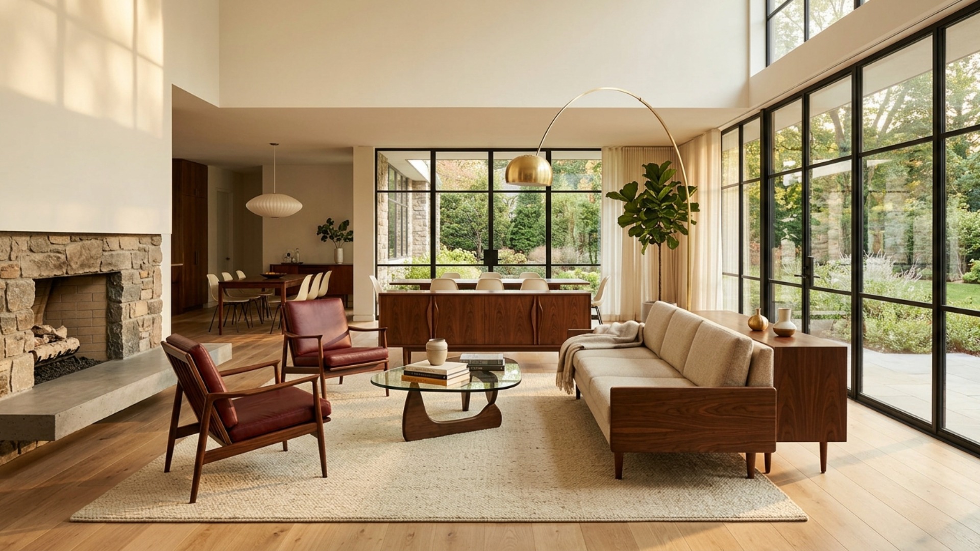
Pull the sofa away from the wall and turn it so its back faces the dining area. This single move defines the living room more than anything you can buy. A mid century sofa is the right tool because it is low enough not to block the sightline, has a properly finished back, and stands on legs so the floor runs underneath and the space still reads as connected. Leave at least 30 inches of walkway behind it.
-
02
Put a credenza behind the sofa to make the edge deliberate
A six-foot walnut credenza set directly behind the floated sofa turns an improvised arrangement into an obvious one. It gives you storage where an open plan usually has none, a surface for a lamp that lights the seating from behind, and a visual line that both zones can read from. Keep it under 30 inches high so it never becomes a wall, and make sure the back panel is finished, since the dining side will see it constantly.
-
03
Size the rug to the zone, not to the room
This is where most open plans go wrong. The rug should sit under the full seating group, with at least the front legs of every piece on it, and it should stop where the living zone stops. A 9 by 12 is the usual answer in a room like this, and going smaller is the single most common mistake. A rug that floats in the middle of a seating group makes the whole zone read as provisional rather than settled.
-
04
Angle the chairs to close the group and cut the sound
Two lounge chairs facing the sofa at an angle close the seating into a conversational shape and stop the zone leaking toward the kitchen. Leather ones do double duty in an open plan, since hard floors and high ceilings usually mean the room echoes, and upholstery plus a heavy rug plus lined curtains will take that ring out. The acoustics are the part of open plan living nobody photographs and everybody notices.
-
05
Test the zoning in Framehouse before you rearrange anything
Floated furniture is the arrangement people find hardest to picture, and in an open plan the difference between a walkway that works and one that does not is a matter of inches. Photograph the room from the kitchen end, run the mid century modern direction, and look at the sofa position, the credenza line, and the rug size together before you move anything heavy or order a rug that cannot go back.
Built for open plan fix
Moves that pay off
Open plan is a zoning problem, and most of the fixes cost nothing beyond a rug and a willingness to move furniture.
- Define circulation first. Decide the path from the front door to the kitchen, keep it at least 36 inches wide, and arrange the living zone to sit beside that path rather than across it.
- Use lighting to separate zones rather than a single ceiling grid. A pendant over the table and lamps in the living zone will divide the space more convincingly than any furniture.
- Keep everything under 34 inches tall in the middle of the room. Height in the centre of an open plan chops the volume up and undoes the reason for having it.
- Repeat one material across both zones so they read as related. Walnut on the credenza and on the dining table is usually enough.
- Do not buy a room divider screen. In an open plan it reads as a partial wall that failed, where a credenza reads as furniture doing a job.
- Solve the acoustics early. A heavy rug, lined curtains, and upholstered seating will change how the room feels more than another piece of furniture.
mid century modern cues
What to keep, what to skip
Mid century modern suits open plan because it was designed for it, but it goes wrong when the pieces get too big for the room they are dividing.
- Palette: walnut or teak as the anchor, warm cream and oatmeal as the field, and one saturated accent such as oxblood, olive, or mustard on a single piece.
- Materials: oiled walnut and rosewood with strong grain, aniline leather, wool boucle and tweed, brushed brass, and stone or oak underfoot.
- Structural signature: low horizontal lines with visible legs. The continuous strip of floor under every piece is what keeps an open plan reading as one connected volume.
- Backs matter: in an open plan every piece is seen from behind, so choose sofas and credenzas with finished rear panels and skip anything with an exposed frame or a stapled back.
- One statement light per zone: a Bubble pendant over the table, an arched floor lamp over the sofa. Two sculptural lights in the same zone compete.
- Skip: full walls of built-in shelving, tall room dividers, matching furniture sets, and orange and brown used together.
Use it for
What people plan with Framehouse
- Test whether a floated sofa leaves a usable path to the kitchen
- See how a 9 by 12 rug changes the edges of the seating zone
- Compare walnut against your existing dining table finish
- Check that a credenza behind the sofa does not block the sightline
- Show a partner two zoning options before moving anything
Quick answers
Common questions
Make a plan you can act on
Skip the spiral of mood boards. Three minutes in the Aura Quiz turns your taste into a direction.
Take the Aura Quiz