Scandinavian Studio Apartment Ideas for Maximizing Space
Scandinavian design was built in small northern apartments, which is exactly why it is the most useful style for a studio. The trick is that it makes a room feel bigger by adding warmth and storage, not by removing things.
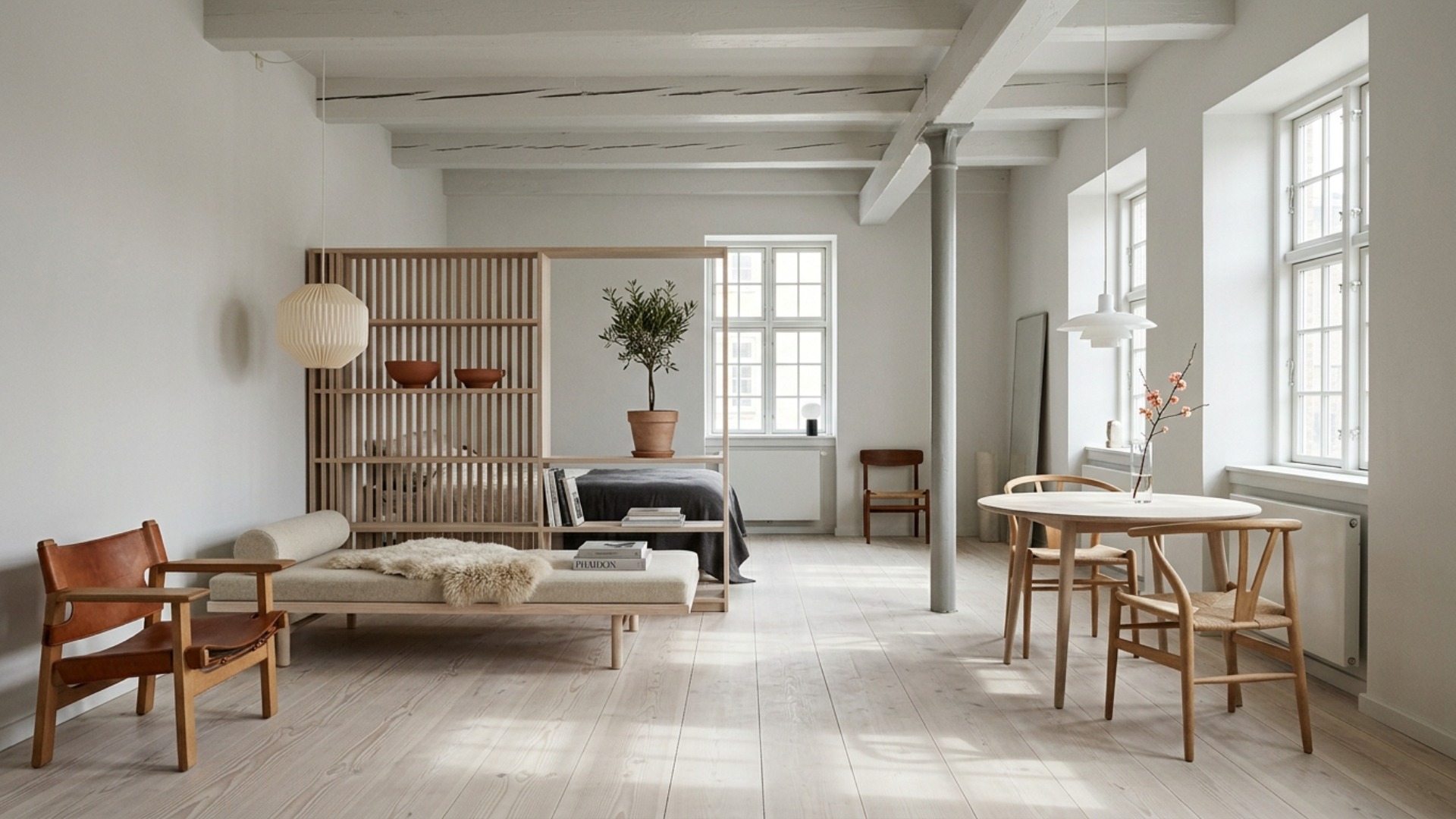
The real problem
Why this is harder than it looks
The usual small-studio advice is to buy multifunctional furniture, and it is the single fastest way to end up with a room you dislike living in. A sofa bed, a set of nesting tables, a wall-mounted fold-down desk. Each one is a compromise you renegotiate every day, and none of them is good at either of its two jobs. The bed is uncomfortable, the desk is too shallow to work at, and the room still feels temporary.
Scandinavian interiors get read as minimalism plus flat-pack, so the instinct is to strip the room bare, paint everything white, and buy small. That misses what the tradition is actually doing. Danish and Swedish apartments have always been small, and the answer that developed there was not austerity. It was built-in storage that disappears into the wall, seating generous enough that you want to stay in it, and enough wool, sheepskin, and pale wood that a room with very little in it still feels warm at four in the afternoon in November.
Your situation is one rectangle asked to do four jobs: sleep, work, eat, and host. The bed usually sits against the only wall with no door or window in it, the kitchen run competes with the living zone for the same floor, and there is nowhere to put anything, so surfaces fill up and the room reads as cluttered even when it is clean.
The honest answer is that a studio cannot do four jobs well. It can do two. Choosing which two, and then buying full-size versions of those two rather than folding versions of all four, is the whole discipline. A studio with a real bed and a real sofa and no dining table feels larger than a studio with a sofa bed, a bistro set, and a desk, even though the second one technically does more.
A clear path
How to plan it
-
01
Decide which two functions the room is genuinely for
Write down how you actually spent the last two weeks at home rather than how you imagine you will live. Most people find they sleep and work, or sleep and host, but almost never all four in meaningful amounts. Commit to two, buy those at full size, and solve the others in a way that borrows: eat at a 70cm round table that also works as a desk, or host on a real sofa rather than at a table you sit at twice a year.
-
02
Put the storage on the walls, floor to ceiling, in the wall colour
Floor-standing furniture eats the thing you are short of. Wall-mounted shelving 28 to 32cm deep, run to the ceiling and painted or specified in the same tone as the wall, holds enormous amounts and visually disappears. String Furniture is the reference version and IKEA Ivar painted in your wall colour is the same idea at a tenth of the price. Leave the bottom 40cm open so the floor keeps running underneath.
-
03
Raise everything onto legs and keep the floor visible
A room reads as large in proportion to how much floor you can see, which is why Scandinavian furniture sits on slim tapered legs rather than plinths. Choose a sofa and bed frame with 15 to 20cm of visible leg, skip the storage ottoman and the platform bed, and use one large rug rather than several small ones so the floor plane stays continuous. This costs nothing and does more than most purchases.
-
04
Take out the ceiling fixture and light the room at three heights
A single overhead light flattens a room and makes the corners disappear, which makes a studio feel smaller than it is. Aim for a pendant low over the table, a wall or clip lamp at the sleeping end, and a floor lamp near the seating, all at 2700K and all on dimmers. Lighting the far corners is what tells the eye how deep the room actually goes.
-
05
Test the layout in Framehouse before you buy the sofa or the bed
Layout mistakes in a studio are the expensive kind, because a sofa that turns out to be 20cm too deep blocks the only circulation route and cannot be returned easily. Upload a photo of your studio and generate the Scandinavian version with the pieces placed where you are planning to put them. Seeing the room with the bed moved is far more convincing than a floor plan, and it takes minutes.
Built for studio maximization
Moves that pay off
Maximizing a studio is mostly about circulation and storage, not about square footage. The moves below buy back usable room without moving a wall.
- Keep one clear walking route from the door to the window and do not put anything in it, even something low.
- Store vertically. Everything above 1.8m is space you are already paying for and probably not using.
- Buy one large piece rather than three medium ones. Visual fragmentation is what makes a small room feel busy.
- Choose a bed with drawers underneath only if the alternative is a wardrobe. Otherwise keep the underside open and the floor visible.
- Put the dining surface on wheels or castors if you host more than once a month, so the floor can change shape for an evening.
- Resist mirrors as a space trick. One large mirror opposite the window helps. Three scattered mirrors just add reflections of clutter.
scandinavian cues
What to keep, what to skip
Scandinavian is a warm style that gets rendered as a cold one. Getting the materials right is what separates it from generic white minimalism.
- Palette: chalk white or soft off-white walls, pale ash or birch, warm grey, and one muted accent. Burnt sienna, dusty rose, and deep olive all sit well. Bright primary colours do not.
- Wood: pale and matte, soaped or lye-treated rather than lacquered. Avoid anything with an orange or red stain, which is the most common way the look goes wrong.
- Textiles do the heavy lifting: undyed wool, natural sheepskin, heavy washed cotton, and a flatweave or wool rug. A Scandinavian room without textiles reads as a clinic.
- Structural signature: honest joinery left visible. Exposed tenons, slatted screens, and simple butt joints are part of the aesthetic rather than something to hide.
- One black element per room for definition, usually a lamp or a chair frame. More than one and the room tips cold.
- Skip: reindeer motifs, all-grey palettes, glossy white lacquer, and the word hygge printed on anything.
Use it for
What people plan with Framehouse
- Test a studio layout before you commit to a sofa size
- See whether the bed can move to the other wall
- Compare pale ash against the flooring you already have
- Show a landlord or partner what the change will look like
- Decide between wall shelving and a freestanding wardrobe
Quick answers
Common questions
Make a plan you can act on
Skip the spiral of mood boards. Three minutes in the Aura Quiz turns your taste into a direction.
Take the Aura Quiz